Categories
Photography Reviews

The Problem with Glass’ AI Explore Feature

Graffiti Alley, Toronto, 2023

I’m a street photographer and have taken tens of thousands of images over the past decade. For the past couple years I’ve moved my photo sharing over to Glass, a member-paid social network that beautifully represents photographers’ images and provides a robust community to share and discuss the images that are posted.

I’m a big fan of Glass and have paid for it repeatedly. I currently expect to continue doing so. But while I’ve been happy with all their new features and updates previously, the newly announced computer vision-enabled search is a failure at launch and should be pulled from public release.

To be clear: I think that this failure can (and should) be rectified and this post documents some of the present issues with Glass’ AI-enabled search so their development team can subsequently work to further improve search and discoverability on the platform. The post is not intended to tarnish or otherwise belittle Glass’s developers or their hard work to build a safe and friendly photo sharing platform and community.

Trust and Safety and AI technologies

It’s helpful to start with a baseline recognition that computer vision technologies tend to be, at their core, anti-human. A recent study of academic papers and patents revealed how computer vision research fundamentally strips individuals of their humanity by way of referring to them as objects. This means that any technology which adopts computer vision needs to do so in a thoughtful and careful way if it is to avoid objectifying humans in harmful ways.

But beyond that, there are key trust and safety issues that are linked to AI models which are relied upon to make sense of otherwise messy data. In the case of photographs, a model can be used to subsequently enable queries against the photos, such as by classifying men or women in images, or classifying different kinds of scenes or places, or so as to surface people who hold different kinds of jobs. At issue, however, is that many of the popular AI models have deep or latent biases — queries for ‘doctors’ surface men, ‘nurses’ women, ‘kitchens’ associated with images including women, ‘worker’ surfacing men — or they fundamentally fail to correctly categorize what is in the image, with the result of surfacing images that are not correlated with the search query. This latter situation becomes problematic when the errors are not self-evident to the viewer, such as when searching for one location (e.g., ‘Toronto’) reveals images of different places (e.g., Chicago, Singapore, or Melbourne) but that a viewer may not be able to detect as erroneous.

Bias is a well known issue amongst anyone developing or implementing AI systems. There are numerous ways to try to technically address bias as well as policy levers that ought to be relied upon when building out an AI system. As just one example, when training a model it is best practice to include a dataset card, which explains the biases or other characteristics of the dataset in question. These dataset cards can also explain to future users or administrators how the AI system was developed so future administrators can better understand the history behind past development efforts. To some extent, you can think of dataset cards as a policy appendix to a machine language model, or as the ‘methods’ and ‘data’ section of a scientific paper.

Glass, Computer Vision, and Ethics

One of Glass’ key challenges since its inception has been around onboarding and enabling users to find other, relevant, photographers or images. While the company has improved things significantly over the past year there was still a lot of manual work to find relevant work, and to find photographers who are active on the platform. It was frustrating for everyone and especially to new users, or when people who posted photos didn’t categorize their images with the effect of basically making them undiscoverable.

One way to ‘solve’ this has been to apply a computer vision model that is designed to identify common aspects of photos — functionally label them with descriptions — and then let Glass users search against these aspects or labels. The intent is positive and, if done well, could overcome a major issue in searching imagery both because the developers can build out a common tagging system and because most people won’t take the time to provide detailed tags for their images were the option provided to them.

Sometimes the system seems to work pretty well. Searching for ‘street food vendors’ pulls up pretty accurate results.

However, when I search for ‘Israeli’ I’m served with images of women. When I open them up there is no information suggesting that the women are, in fact, Israeli, and in some cases images are shot outside of Israel. Perhaps the photographers are Israeli? Or there is location-based metadata that geolocates the images to Israel? Regardless, it seems suspicious that this term almost exclusively surfaces women.

Searching ‘Arab’ also brings up images of women, including some who are in headscarves. It is not clear that each of the women are Arabic. Moreover, it is only after 8 images of women are presented is a man in a beard shown. This subject, however, does not have any public metadata that indicates he is, or identifies as being, Arabic.

Similar gender-biased results happen when you search for ‘Brazillian’, ‘Russian’, ‘Mexican’, or ‘African’. When you search for ‘European’, ‘Canadian’, ‘American’, ‘Japanese’, however, you surface landscapes and streetscapes in addition to women.

Other searches produce false results. This likely occurs because the AI model has been trained that certain items in scenes are correlated to concepts. As an example, when you search for ‘nurse’ the results are often erroneous (e.g., this photo by L E Z) or link a woman in a face mask to being a nurse. There are, of course, also just sexualized images of women.

When searching for ‘doctor’ we can see that the model likely has some correlation between a mask and being a doctor but, aside from that, the images tend to return male subjects as images. Unlike ‘nurse’ there are no sexualized images of men or women that immediately are surfaced.

Also, if you do a search for ‘hot’ you are served — again — with images of sexualized women. While the images tend to be ‘warm’ colours they do not include streetscapes or landscapes.

Doing a search for ‘cold’, however, and you get cold colours (i.e., blues) along with images of winter scenes. Sexualized female images are not presented.

Consider also some of the search queries which are authorized and how they return results:

  • ‘slut’ which purely surfaces women
  • ‘tasty’ which surfaces food images along with images of women
  • ‘lover’ which surfaces images of men and women, or women alone. It is rare that men are shown on their own
  • ‘juicy’ which tends to return images of fruit or of sexualized women
  • ‘ugly’ which predominantly surfaces images of men
  • ‘asian’ which predominantly returns images of sexualized Asian women
  • ‘criminal’ which often appears linked to darker skin or wearing a mask
  • ‘jew’ which (unlike Israeli) exclusively surfaces men for the first several pages of returned images
  • ‘black’ primarily surfaces women in leather or rubber clothing
  • ‘white’ principally surfaces white women or women in white clothing

Note that I refrained from any particularly offensive queries on the basis that I wanted to avoid taking any actions that could step over an ethical or legal line. I also did not attempt to issue any search queries using a language other than English. All queries were run on October 15, 2023 using my personal account with the platform.

Steps Forward

There are certainly images of women who have been published on Glass and this blogpost should not be taken as suggesting that these images should be removed. However, even running somewhat basic queries reveal that (at a minimum) there is an apparent gender bias in how some tags are associated with men or women. I have only undertaken the most surface level of queries and have not automated searches or loaded known ‘problem words’ to query against Glass. I also didn’t have to.

Glass’ development team should commit to pulling its computer vision/AI-based search back into a beta or to pull the system entirely. Either way, what the developers have pushed into production is far from ready for prime time if the company—and the platform and its developers—are to be seen as promoting an inclusive and equitable platform that avoids reaffirming historical biases that are regularly engrained in poorly managed computer vision technologies.

Glass’ developers have previously shown that they deeply care about getting product developments right and about fostering a safe and equitable platform. It’s one of the reasons that they are building a strong and healthy community on the platform. As it stands today, however, their AI-powered search function violates these admirable company values.

I hope that the team corrects this error and brings the platform, and its functions, back into comportment with the company’s values rather than continue to have a clearly deficient product feature deployed for all users. Maintaining the search features, as it exists today, would undermine the team’s efforts to otherwise foster the best photographic community available on the Internet, today.

Glass’ developers have shown attentiveness to the community in developing new features and fixing bugs, and I hope that they read this post as one from a dedicated and committed user who just wants the platform to be better. I like Glass and the developers’ values, and hope these values are used to undergird future explore and search functions as opposed to the gender-biased values that are currently embedded in Glass’ AI-empowered search functions.

Categories
Photo Essay Photography

Favourite Photos of Summer 2023

I’ve had the good fortune to get out and take photos pretty well every week of the summer. On the whole I’ve enjoyed decent light, good and interesting weather, and lots of events that opened up opportunities to capture the city in interesting ways.

Paulie B. has a recent video where he asked street photographers about their top photo or two of the summer. Inspired by his video, I thought that I’d post a few of my photos and explain why I liked them. All of these photos were first shared on Glass, and Fuji images relied on my “Classic Monochrome” recipe.

Brock & Dundas, Toronto, 2023

This was taken at one of the first festivals of the summer. I just walked back and forth through it over a couple of days and left with a number of images I liked, with this probably my favourite. Why?

First, I love the woman’s expression in her relationship to the officer, as well as with the pineapples: what exactly is the problem? Why is she so shocked? What has the officer said, if anything?

Second, I liked the background — it showcases this part of Toronto. It’s not filled with the new shiny glass buildings and condos, and still has some of the older shops and signs. This location gives a sense of ‘where’ this image was taken.

Third, I just like having images with pineapples in them. I don’t know why but I can tell it’s a motif in studying the images that I’ve taken over the years.

Queens Quay & Spadina, Toronto, 2023

This image was taken on Toronto’s waterfront. It just captures all the things that summer can be in Toronto: ferries coming from the Toronto islands, some people relaxing along the water, seagulls (which are everywhere along the waterfront in the summer), travellers landing at the island airport, and just a sense of activity and calm.

York & Wellington, Toronto, 2023

Taken from the financial district of downtown Toronto, I really liked how the light was falling on the scene and the way that the male subject is relaxing against the bulls. It almost feels pastoral to me, which isn’t the typical experience I get when walking around (or living in) the downtown core.

Queen & Bay, Toronto, 2023

I’m a sucker for taking photos of ice cream trucks and I really liked how this guy was looking out of the truck while a pigeon was just wandering by in the lower left of the frame. Is this the most complex image I took in the summer? Nope. But I still liked the environmental portrait that was captured.

Spadina & St Andrew, Toronto, 2023

Taken along one of my regular patrol routes, there’s a lot that I like throughout this frame.

It has a lot of construction elements — something I’ve been deliberately including in my street photos as part of a long-term project — and there’s some sub-framing that comes out because of how the shadows lay against the wall. The subjects to the far right of the frame are somewhat interesting — what are they pointing at? And does it intersect with the ‘caution’ warning? — but their shadows are where they shine. The shadows seem like they’re up to…something…while at the same time there is a subject that is reminiscent of the Invisible Man wandering along the left side of the frame. In aggregate, this scene has a degree of dimensionality that I really liked, some subjects of interest, and fit within an ongoing project.

Queens Quay & Bay, Toronto, 2023

I’m always a sucker for isolated subjects in the city who are in interesting situations, or have interesting expressions or body language. This photograph captures this for me.

I like that the main subject seems somewhat desolate, and yet is sitting alongside a series of summer treats and toys. And the fact that this is a vendor who only takes cash? I wonder when such signs are going to be real indicators of a distant past. The other piece that I like is how the top, right, and left of the frame are all food-related: the subject is selling popcorn and candies, hotdogs are being sold along the left of the frame, and the top of the frame can refer to top-end gourmet restaurants. So there’s multiples ‘frames’ to the subject which, again, adds a degree of structure or complexity into the composition.

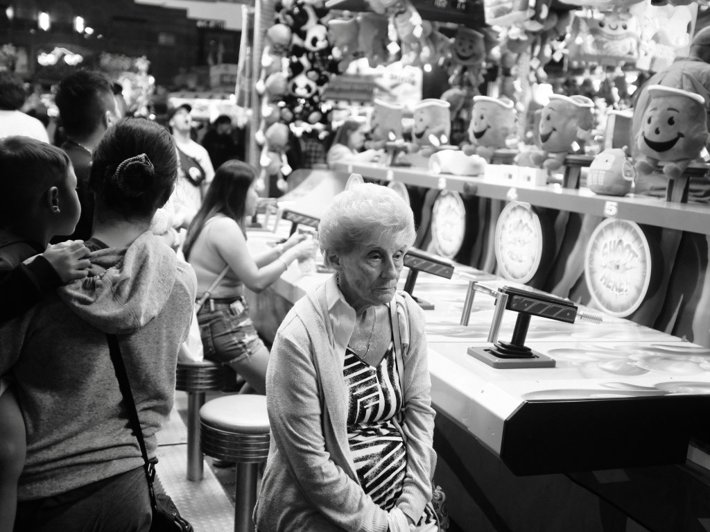
Canadian National Exhibition, Toronto, 2023

This was taken during the waning days of the CNE, which is a massive festival that takes place annually in Toronto. People are typically excited and happy, but our older subject, here, seems sad, quiet, or in deep contemplation.

Having her placed against games and the Kool-Aid Man on one side, and the child and mother on the other, really underscores her emotional state in what is typically a festive situation. I also like the depth of the photo that indicates where the women is in Toronto. This leaves the viewer with a deeper sense of context, which helps to amplify the woman’s facial expression and body language.

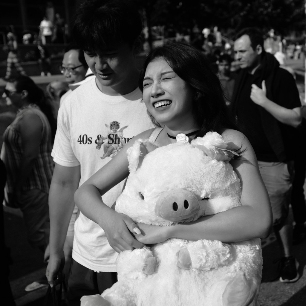
Canadian National Exhibition, Toronto, 2023

The final photo of the summer is another from the CNE. The subjects in this one exemplify what is ‘normal’ in the summer — happiness, togetherness, and fun. The subjects’ expressions and open and apparent and I love how large the stuffed pig is in context to the woman — what will she do with it once she gets it home?

While it’s not the most complicated of photos I took over the summer it expresses a sense of unadulterated happiness or joy that regularly brings a smile to my face.

Categories
Photography Writing

Street Photography in a More Private World

Jack Layton Ferry Terminal, Toronto, 2023

For the past several months Neale James has talked about how new laws which prevent taking pictures of people on the street will inhibit the documenting of history in certain jurisdictions. I’ve been mulling this over while trying to determine what I really think about this line of assessment and photographic concern. As a street photographer it seems like an issue where I’ve got some skin in the game!

In short, while I’m sympathetic with this line of argumentation I’m not certain that I agree. So I wrote a longish email to Neale—which was included in this week’s Photowalk podcast—and I’ve largely reproduced the email below as a blog post.

I should probably start by stating my priors:

  1. As a street photographer I pretty well always try to include people in my images, and typically aim to get at least some nose and chin. No shade to people who take images of peoples’ backs (and I selectively do this too) but I think that capturing some of the face’s profile can really bring many street photos to life.1
  2. I, also, am usually pretty obvious when I’m taking photos. I find a scene and often will ‘set up’ and wait for folks to move through it. And when people tell me they aren’t pleased or want a photo deleted (not common but it happens sometimes) I’m usually happy to do so. I shoot between 28-50mm (equiv.) focal lengths and so it’s always pretty obvious when I’m taking photos, which isn’t the case with some street photographers who are shooting at 100mm . To each their own but I think if I’m taking a photo the subjects should be able to identify that’s happening and take issue with it, directly, if they so choose to.

Anyhow, with that out of the way:

If you think of street photography in the broader history of photography, it started with a lot of images with hazy or ghostly individuals (e.g. ‘Panorama of Saint Lucia, Naples’ by Jones or ’Physic Street, Canton’ by Thomson or ‘Rue de Hautefeuille’ by Marville). Even some of the great work—such as by Cartier-Bresson, Levitt, Bucquet, van Schaick, Atget, Friedlander, Robert French, etc—include photographs where the subjects are not clearly identified. Now, of course, some of their photographs include obvious subjects, but I think that it’s worth recognizing that many of the historical ‘greats’ include images where you can’t really identify the subject. And… that was just fine. Then, it was mostly a limitation of the kit whereas now, in some places, we’re dealing with the limitations of the law.

Indeed, I wonder if we can’t consider the legal requirement that individuals’ identifiable images not be captured as potentially a real forcing point for creativity that might inspire additional geographically distinctive street photography traditions: think about whether, in some jurisdictions, instead of aperture priority being a preferred setting, that shutter priority is a default, with speeds of 5-15 second shutters to get ghostly images.2

Now, if such a geographical tradition arises, will that mean we get all the details of the clothing and such that people are wearing, today? Well…no. Unless, of course, street photographers embrace creativity and develop photo essays that incorporate this in interesting or novel ways. But street photography can include a lot more than just the people, and the history of street photography and the photos we often praise as masterpieces showcase that blurred subjects can generate interesting and exciting and historically-significant images.

One thing that might be worth thinking about is what this will mean for how geographical spaces are created by generative AI in the future. Specifically:

  1. These AI systems will often default to norms based on the weighting of what has been collected in training data. Will they ‘learn’ that some parts of the world are more or less devoid of people based on street photos and so, when generating images of certain jurisdictions, create imagery that is similarly devoid of people? Or, instead, will we see generative imagery that includes people whereas real photos will have to blur or obfuscate them?
  2. Will we see some photographers, at least, take up a blending of the real and the generative, where they capture streets but then use programs to add people into those streetscapes based on other information they collect (e.g., local fashions etc)? Basically, will we see some street photographers adopt a hybrid real/generative image-making process in an effort to comply with law while still adhering to some of the Western norms around street photography?

As a final point, while I identify as a street photographer and avoid taking images of people in distress, the nature of AI regulation and law means that there are indeed some good reasons for people to be concerned about the taking of street photos. The laws frustrating some street photographers are born from arguably real concerns or issues.

For example, companies such as Cleaview AI (in Canada) engaged in the collection of images and, subsequently, generated biometric profiles of people based on scraping publicly available images.

Most people don’t really know how to prevent such companies from being developed or selling their products but do know that if they stop the creation of training data—photographs—then they’re at least less likely to be captured in a compromising or unfortunate situation.

It’s not the photographers, then, that are necessarily ‘bad’ but the companies who illegally exploit our work to our detriment, as well as to the detriment of the public writ large.

All to say: as street photographers, and photographers more generally, we should think broader than our own interests to appreciate why individuals may not want their images taken in light of technical developments that are all around us. And importantly, the difference is that as photographers we do often share our work whereas CCTV cameras and such do not, with the effect that the images we take can end up in generative AI, and non-generative AI training data systems, whereas the cameras that are monitoring all of us always are (currently…) less likely to be feeding the biometric surveillance training data beast.


  1. While, at the same time, recognizing that sometimes a photo is preferred because people are walking away from the camera/towards something else in the scene. ↩︎
  2. The ND filter manufacturers will go wild! ↩︎
Categories
Photography

My Summer 2023 Fuji X100F Recipes

I’ve been shooting with a Fuji X100F for three years now, having gotten a used one for $800 CAD just prior to the start of the COVID-19 pandemic. Since purchasing it I’ve shot well north of 100,000 photos, and retained approximately 12,000 after culling.

In mid-October 2021 I built or adapted a recipe for monochrome images. In mid-2022 I found a ‘Leica-like’ colour recipe which I’ve kept in camera, though not used all that often. During my ownership of the camera I’ve made a lot of other recipes and just not really used them.

I’m back in isolation for the second time in 6-7 months and so took the time this weekend to update my Custom profiles. I know that others find these kinds of profiles/recipes helpful and so I thought I’d post them for others who are interested. In the case of Custom One and Custom Four I include a small selection of images that were made with the respective recipes.

Global Note

Ages ago I set my White Balance to Auto (R 2, B -2). My preference would be to have the white balance associated with each Custom mode but that’s only possible with the X100V, so I just have set this and left it.

Generally, I wanted to make sure that Custom One was the most commonly used recipe that I used. Previously, this was set to Customer Five which was fine (I had muscle memory on flipping back to it in the menu) but added more work than should have existed. I then tried to batch the ‘key’ monochrome and colour profiles together; Custom Seven is a default Acros but I don’t really expect to dig that deep into my Custom Recipes to get to it all that often.

Also, for the past year or so I’ve kept a Moment Cinebloom 10% on the lens, which gives images a slightly softer image and blooms light.

Custom One—“My Classic Monochrome”

I have shot a lot of images with this recipe, probably to the tune of retaining about 8,000 frames over a year and a half. Generally, I find that in hard lighting (with strong shadows and bright highlights) that it benefits from dialling the exposure down by -⅔ to -1.0. In brighter light, however, I find that it works best to dial up exposure by at least ⅓ and often ⅔.

  • DR: 200
  • Film Simulation: Black and White
  • Grain Effect: Weak
  • While Balance: Auto
  • Highlight Tone: 2
  • Shadow Tone: 2
  • Colour: 0
  • Sharpness: -1
  • Noise Reduction: 0

I do find that with this profile I sometimes use the Brush in Snapseed to either Dodge & Burn or increase exposure on faces when they’re hidden in shadows.

Custom Two—“Ilford HP5 Plus”

This is the recipe from Fuji X Weekly. I haven’t shot with it as of yet, but am curious to see how it looks as compared to my ‘normal’ (Custom One) monochrome recipe. Based on the settings it should naturally have a stronger contrast than comes normally with Custom One.

  • DR: 200
  • Film Simulation: Acros
  • Grain Effect: Strong
  • While Balance: Auto
  • Highlight Tone: 4
  • Shadow Tone: 2
  • Colour: 0
  • Sharpness: 0
  • Noise Reduction: -3
  • Exposure Compensation: 0 (Normally)

Custom Three—“Astia Kodak Ektar 100”

Another recipe from Fuji X Weekly! I like this as it’s punchy but somewhat soft in its nature. I’m going to be a bit curious to see how this looks with my Moment Cinebloom 10% Filter.

  • DR: DR-Auto
  • Film: Astia
  • Grain: None
  • White Balance: Auto
  • Highlight Tone: 1
  • Shadow Tone: 3
  • Colour: 4
  • Sharpness: 1
  • Noise Reduction: -3
  • Exposure Compensation: 0 to ⅓ (typically)

Note: while the recipe calls for 3 Red and -2 Blue, my white balance is set to 2 Red and -2 Blue.

Custom Four—“Leica Colour”

I have no idea where precisely this came from but it’s been the only colour profile I’ve used for the past year or so. I really like how saturated and bright it is, but really have no idea how much what comes through is really ‘Leica-like’. This was just the description provided by wherever I copied the recipe.

  • DR: 200
  • Film: Standard
  • Grain: None
  • White Balance: Auto
  • Highlight Tone: 1
  • Shadow Tone: 1
  • Colour: 3
  • Sharpness: 1
  • Noise Reduction: 0

Custom Five—“Punchy Classic Chrome”

I have a love of Classic Chrome, and added this to make it a little more saturated than typical. I also wanted to see about adding more dramatic contrast between highlights and shadows, which is something I often tried to do in post when I first shot Classic Chrome a few years ago.

  • DR: 200
  • Film: Classic Chrome
  • Grain: None
  • White Balance: Auto
  • Highlight tone: 2
  • Shadow Tone: 2
  • Colour: 1
  • Sharpness: 1
  • Noise Reduction: 0

Custom Six—“Punchy Pro High-Neg”

I…haven’t really ever taken a photo with Pro High-Neg before. So I don’t quite know how this recipe will play out or even how much I might use it.

  • DR: Auto
  • Film: Pro High-Neg
  • Grain: Weak
  • WB: Auto
  • Highlight: 1
  • Shadow: 1
  • Colour: 1
  • Sharpness: -1
  • Noise Reduction: 0

Custom Seven—“Acros Bland”

This is a pure Acros recipe with no changes. I just want it present to be able to quickly flip to it and try it out at some point.

  • DR: 200
  • Film: Acros
  • Grain: Off (Acros increases grain normally as you exceed 800 ISO)
  • WB: Auto
  • Highlight: 0
  • Shadow: 0
  • Colour: NA
  • Sharpness: 0
  • Noise Reduction: 0
Categories
Photography

The Backstory: Bay & Queen, Toronto, 2023

Bay & Queen, Toronto, 2023

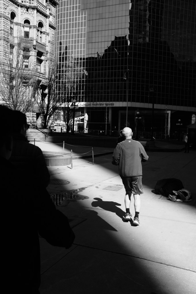
I made this image while out on my weekend photowalk. I’ve passed this same location hundreds of time since I’ve lived in Toronto. In what might become a semi-regular type of post, I wanted to write a bit about the backstory of the image. It was originally posted to Glass.

I was drawn to this scene, first, just because of how the light managed to slice through the shadows which were cast by the surrounding skyscrapers. After dialling the exposure to -1.3 I waited for some interesting characters to pass through the light.

It was only after taking a couple images that I really noticed how the unhoused person’s feet and legs were apparent. They were on grates that pass steam in the colder times of the year. Some of the unhoused use these grates to stay warm during the winter.

I deliberately avoid taking many head-on or identifiable photos of people who are in distress. I’m generally not a fan of that kind of street photography, unless the photographer chooses to really engage with the subjects in meaningful ways.

Still, the city—and especially the city core—does have a serious and growing housing issue. And so I ultimately decided to compose the scene with the hopes that it would show people noticing, but passing by, the individual on the street, as a kind of broader commentary of the social housing issues that exist in Toronto.

Compositionally the image is simple: a pair of men looking in the direction of the source of the light, and not towards the half shrouded person on the sidewalk, and moving towards the light. Behind them the aperture of the light beam starts to close, but the reader of the photograph can see the sparkle of youth (the new, glass, building) as juxtaposed agains the old (Toronto’s historical city hall). The young reflects the old, reminding us that youth is impermanent. As I said: it’s not a deep photograph nor are any particularly special tricks used to make it.

I often linger when I find light that I like for at least a couple minutes, to see if more interesting (or any interesting!) subjects come to fill the scene. Other times I’ll recompose and work the scene a little bit. But I have to admit that staying put is something that I need to get better with: it’s not enough to just linger for 5-10 minutes!

The above set of images aren’t touched up and are a few of the ‘raw’ versions of images I took and normally wouldn’t post (I took a total of about 20 frames before I settled on the one at the top of the post). I, personally, learn a lot from the older Magnum photos that include contact sheets.

While my rougher images aren’t the same, nor as descriptive, as contact sheets maybe they’ll be helpful to someone else when they are thinking of weighing a scene. Or maybe just to make clear that the admittedly very amateur images I make involve a lot more than just one lucky capture (with a handful of exceptions of course).

Categories
Photo Essay Photography

Winter Stations 2023

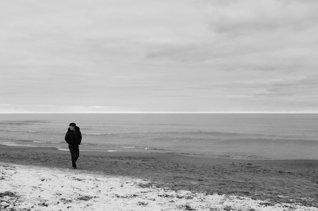
For the past five to six years or so I’ve been going to the Winter Stations outdoor art exhibit in the Beaches area of Toronto. Each year there is an international public competition between artists to put up architectural exhibits that include or encompass a lifeguard station that is set up along the Beach. Depending on the year there is, or isn’t, snow on the ground.

Families, children, and dogs all show up to enjoy (and try to understand!) the various exhibits that go up each year. At this point I see it as one of my ‘Toronto rituals’; the exhibition became important to me many years ago and I’ve refused to let that change. This part of the city, for as long as it lasts, is part of my experience of the city of Toronto itself and the ritual of seeing the exhibitions is part of what it is for me to be a Torontonian.

There’s a lot to enjoy about the experience, not the least being the presence of ‘typical’ beach stuff like the Muskoka chairs that people use along with the moderate starkness of the beach in a relatively inhospitable period of time. Some times that I’ve been to the exhibit has seen me shivering despite wearing multiple layers, along with an insulated vest and long wool coat with wool mittens and hat. Others have seen me just get wet with the rain as it pours onto the same kind of outfit. Fortunately it was a relatively balmy -2 degrees (Celsius) with no precipitation and I stayed warm the whole time, this year!

Each time I come to the art exhibit I not only feel a bit like I’m going through a Toronto-ritual I’ve developed but, also, it reminds me a bit of growing up along the Atlantic. The water isn’t salty and the life guard stations are a lot closer to the water, but it’s about the closest I’m likely to get to my historical home as is likely to occur.

One of the things that I always seem to look for when at this event is the kind of starkness or minimalism that is present in the exhibits. They need to stand up to the elements and, also, the destructive nature of children. And so many of the exhibitions are robust without much decoration. Years ago, there was an exhibit that encouraged children to (and I’m quoting) “interact” with the exhibit. It was ruined by the time that I appeared, though kids still liked jumping on all the damaged bits.

I had the pleasure this time of visiting the exhibit with my partner and a friend who generously put up with me making photos while they had conversations with one another. Despite being the person who was responsible for dragging people to the event—though it wasn’t this cold this time!—I was probably less present and/or took too much time doing my own thing than was likely appreciated. Both are long forgiving in their willingness to indulge me in my hobby.

Each time I return to this part of Toronto I’m reminded of my past: this was where I lived, many moons ago, and where some life changing stuff happened in my life. There’s always a sense of renewal—insofar as the art and people are different—along with a sense of the past that haunts me whenever I walked along this part of Lake Ontario.

At the same time, it’s always invigorating: it’s a place that reminds me of what once was and what is, now. And how great that now is!

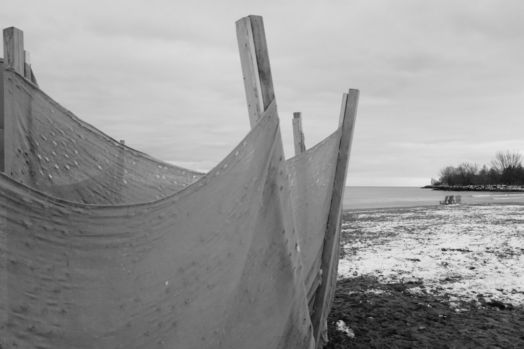
Some of the images I captured while at the exhibition this year, such as the above image of the empty chairs behind the fence, remind me that this space will be renewed soon with beach goers visiting and a liveliness that belies the current (general) absence of humans. Toronto ebbs and flows, and its residents will soon flow back to this part of the city once the weather improves some. I’ll look forward to returning to the Beaches—and capturing them in photographs—when the seasons have shifted!

Categories
Photo Essay Photography Writing

Capturing a January Snowstorm with the iPhone 14 Pro

Toronto ended up getting a proper snowstorm late January. While it wasn’t the first snow of the year it was the first proper storm that saw 15cm of snow (or more) coming down over the course of many hours. In fact, the snow was coming down heavily enough that I didn’t want to risk my non-weather sealed cameras: I’m happy to get them damp by snow but in this weather they were certain to get soaked.

So what was I to do? Despite not being in love with the iPhone 14 Pro it’s a weather sealed camera and capable of making some decent images. So I grabbed it, donned my winter weather gear and some smartphone-compatible gloves, and headed out for a few hours of capturing the city.

When I went out I decided to increase the exposure a bit–set to 0.7–to keep the snow from coming out grey, but I found that exposure kept resetting. I half suspect that this was due to a combination of the somewhat bulky gloves I was using and the water on the screen resetting or modifying the exposure slider. Still, given that I was shooting in ProRAW I could generally modify exposures to my taste when I got home and did some light post-processing.

Speaking of the ProRAWs…I accidentally left the 24mm (equiv.) sensor set to 48MP images from the last time I was shooting with it! Which in hindsight explains why it often took so long to go from pressing the shutter button to capturing an image; I’d thought the delay was because of an issue with the conductive gloves or the cold or the water on the screen but, in fact, was was due to the file size. As always, I should have fully checked my equipment (and its software) before heading out. I’m just glad that I have a 512GB iPhone so at least I didn’t need to worry about running out of space on the device!

I did end up coming home with some smaller files using the main sensor from when I was shooting in burst mode. In burst you will default down to taking 12MP images on the 24mm (equivalent) lens and I used it when shooting faster-action scenes earlier in my walk.

In some notes to myself about the iPhone 14 Pro, I previously wrote:

The 48 megapixel main camera (24mm equivalent) when shot at its full resolution, in ProRAW, doesn’t work well for street photography. I tend to shoot bursts to get people stepping just so in a shot, but there’s an approximately 1 second or so delay in capturing one image and being able to capture another. That’s a shame as this is supposed to be a highlight feature and the A16 processor and specialized ISP just cannot process things fast enough for how I shoot street.

At the time, I didn’t realise the camera app would shift from taking 48MP to 12MP images under burst mode. It’s, also, not something that is apparent in the user interface. Just like, when in the camera app, there’s no indication or warning that you’re shooting at 48MP! All of which is to say that the stock Camera app on iPhone is getting very long in the tooth and is in desperate need of an overhaul.

Lest it sound that I only have negative things to say I should be very clear: I managed to go out and make images for several hours and came back with some that I liked. I couldn’t have gone out with my other camera gear. Since I thought I was shooting with the 12MP 24mm (equiv.) main lens quite often I tried to be fastidious in how I framed shots because I wasn’t going to be able to crop much. By happy accident, this ultimately meant that the images shot on that lens ended up being much higher quality than anticipated due to capturing 48MP images in all of their glory.

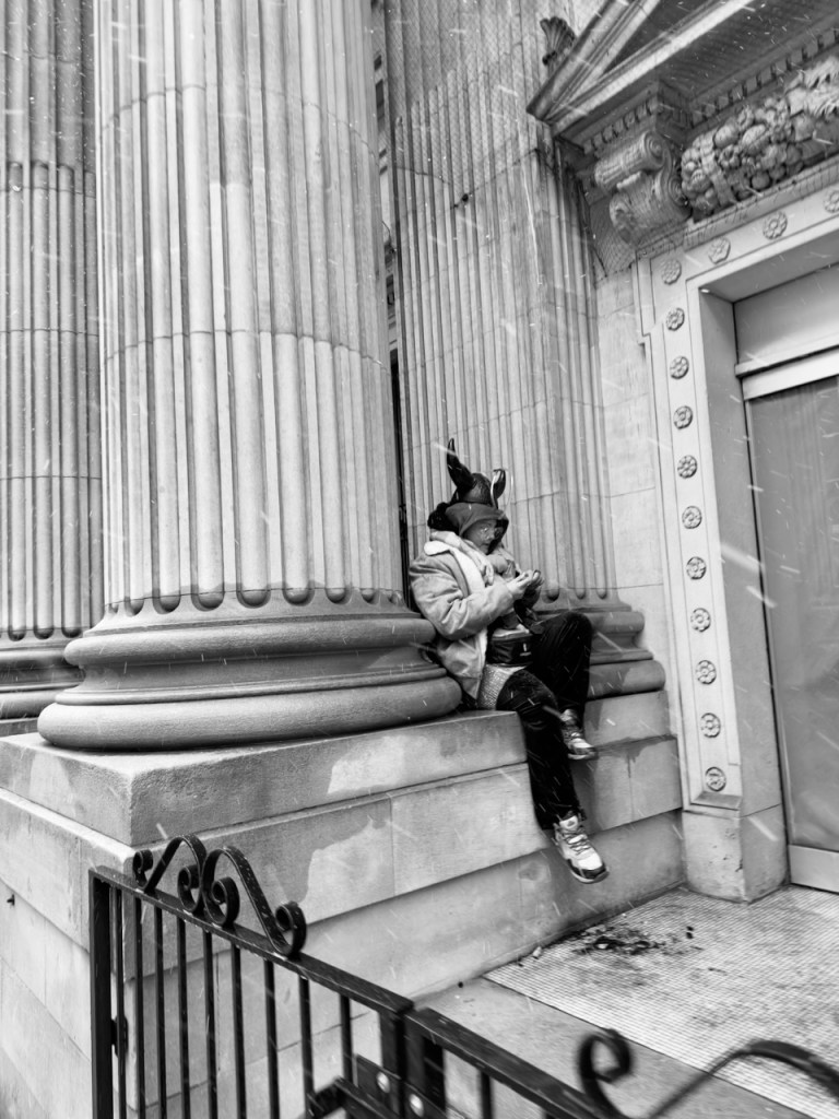
I also took the time to use the ultra-wide as well as telephoto lenses. I admit that I just don’t have a huge amount of experience shooting ultra-wide and so this was a fun experience in seeing what I could capture in the scene. Other images that didn’t quite make the cut saw me experiment with cutting the frame in two, with a divider in the centre of the frame and building scenes to the left and right of it. While I didn’t get any publishable-quality photos it was a good experiment and reminded me of just how challenging it is to replicate photographic masters who use this technique, like Sean Penn. The images I made with the 78mm lens, however, often ended up being too soft and ultimately I’ve opted to publish only one of them (above, woman walking away from sign with an arrow on it while looking at her phone).

When I went out I had hoped that I’d be able to capture the sense of how much the snow was beating down on everyone in the city. I think this came true as the iPhone didn’t shoot above 1/120 of a second the whole day, and at times was as low as 1/23. The result is that the snow is apparent and the subjects–unless they were relatively unmoving–have a bit of blur to them as they raced from place to place.

At the same time, because of the snow most people couldn’t move as quickly as they would on clear sidewalks and roads. It was an interesting personal lesson, insofar as I realised that in this weather I can probably easily get away with 1/80 to 1/200 and get sufficiently sharp images that still communicate the fury of the weather.

As I kept walking, however, a number of annoyances returned. I absolutely hate how holding your finger on the shutter button in the stock iPhone Camera app records a video instead of firing of a burst shot. This was a problem because when I was trying to take a single image sometimes I’d get a very short video, instead, meaning that I was without a photograph! I get that this is how most people probably want to use the app but it’d be nice to be able to customise the app’s functionality some. Especially if these are supposed to be ‘professional’ devices. Also, for reasons I couldn’t figure out, the Podcasts app also sometimes sped up the episodes I was listening to, or even skipped to the next podcast. Frustrating!

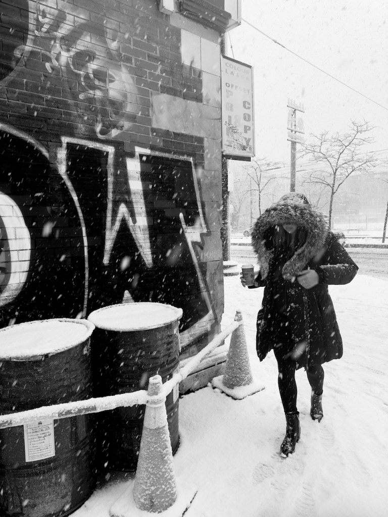
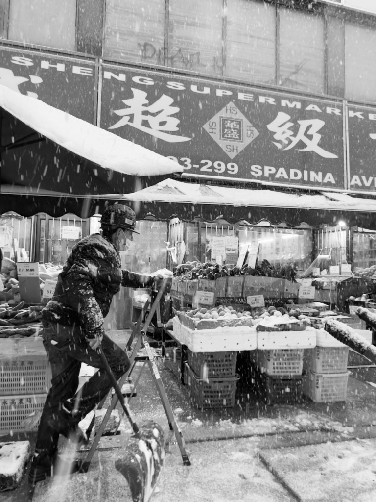
It had been quite some time since I’d walked through Chinatown during a real dropping of snow and it was great to see very familiar scenes in slightly different situations. Catching someone shovelling while, at the same time, a customer was taking refuge in a doorway was a real catch for me. I’m sure I’ve captured images from this location (as in the very spot I was standing in to make the image) dozens of times; this is a very different feel and texture than those I tend to make at this location. Win!

I ended up walking through Kensington Market last year during a slightly-less intense snowstorm and was rewarded with an image that was amongst my favourites of the year. I don’t think that I caught images that will necessarily fall into the same bucket this year, in part because several times I wasn’t able to activate the iPhone camera quickly enough. Still, I liked capturing how desolate the Market was, which was largely reflective of how quiet it was.

I did like how, towards the end of the shoot and into the evening, the snow started to come down even heavier which had the effect of leaving little droplets of water on the lens. While these blotches do upset the ‘perfection’ of the image I think they, also, have the effect of making it that much clearer what the weather was like and ideally put the viewer more firmly into the cold and wet scene.

It was on my return trip home that the worst of the weather was apparent for those who had to brave the wet snow that had piled up over the past many hours. There were relatively few pedestrians out, even at the major intersections, as compared to better-weather times. Hoods were up and high, foot slips were common, and cars were throwing up huge volumes of grey and brown slush onto anyone who happened to get too close to the curb.

Amongst the bravest of the brave were the few cyclists who continued to try and share the road with Toronto drivers. Between the streets that hadn’t been cleared and the erratic behaviour of vehicles whose owners hadn’t driven in the snow in over a year, it seemed risky and not that much faster than just walking. Still, they made for interesting subjects when they were waiting for a chance to get onto the road and make their way to their destination, and especially with the streetcar lines overhead layered with snow.

While cyclists arguably had a hard time of things, even harder times were surely experienced by the parents I saw who were trying to push strollers around. The snow routinely got into the wheels with the effect that parents were just pushing the strollers without the help of the wheels. Still, almost every stroller had a plastic barrier separating the child from the storm which at least meant that the little one’s weren’t getting soaked on their ways home.

Ultimately the images that I came back with after several hours of shooting are qualitatively different from anything I’d have made with my Fuji X100F or Ricoh GR or GRiiix. At least to my eye, they have a feel of an older camera and, due to the slow shutter speeds, many of the images remind me of film photographs I’ve seen of past Toronto winter storms from the 1970s and 1980s. Many also have an almost more intimate quality, to my eye, due to the technical imperfections that resulted from lighting conditions and occasional focus challenges. Still, I feel like they present the experience of the storm that lasted throughout the day and night, and which left the city blanketed in white by the following morning.

Categories
Photo Essay Photography Writing

First Snow of 2023 Photowalk

We got our first snow of the year on Sunday. I kept waiting for it to come and as soon as the snow started to fall I grabbed my Fuji X100F with a Cinebloom 10% attached and headed out to make some images.

I live in a densely populated section of Toronto. Notwithstanding the snow there were many people out and about when I first hit the streets. But it was as I moved to side streets, or into parts of the city that tend to be populated by tourists, that it was apparent that huge chunks of the city were largely depopulated as people decided to stay inside where it was warm and dry.

There were, of course, some people out even in the less populated parts of the city. They, however, tended to be trying to get out of the snow—which functionally turned into snow that was almost indistinguishable from rain towards the early evening—and generally wanted to just avoid getting wet or cold.

Somewhat surprisingly I saw almost no other photographers out and about. I’m sure they were there, somewhere. But, at the same time, I wonder how much the weather dissuaded them from getting out and shooting the streets or urban landscapes.

I will never be accused of babying my cameras. My Fuji X100F lacks the weatherproofing of the newest version and, so, when I’m out in the snow I tend to protectively place one hand over it’s screen and eyepiece, and keep the lens pointed downwards and slightly in towards my body. It doesn’t prevent all the precipitation from getting onto the camera but, along with brushing off water when it starts to gather on dials and such, has always seemed good enough to keep the equipment safe.

The mix of heavy coats and umbrellas is something that I’m always curious about, if only because I can’t recall ever seeing something similar while I was growing up or when I visit parts of the country (or world) that receive large volumes of snow. I don’t dispute the potential utility of an umbrella—it will, obviously, help to keep your head wet and my uncovered head certainly got soaked after 3-4 hours outside—but it always seems like an instrument that is out of place. Though they look very distinct in the snow and so I definitely took the chance to make images of people who were carrying them!

Though there were people out and about, and evidence in other cases of someone having been present recently, much of the city felt oddly solitary. When I make my photos I’m often trying to communicate a sense of, on the one hand, the press of other people around and upon us and, on the other, the loneliness or isolation experienced while being in these massive urban environments. Dismal weather almost always draws me to the latter and wanting to express how large our environments are and what they look like with few figures or, alternately, in the absence of humans entirely. What will the city look like when the humans are gone?

When I watched one of James Popsys’ videos recently he mentioned that, when taking his landscapes, he likes putting either a human or a human-made thing in his images. Doing so has the effect of communicating human presence and, often, what the natural environment looks in our absence. Human-made things, also, have the effect of drawing us into an image on the basis that we ‘see’ something of ourselves in the otherwise natural environment.

In an almost modernist way of thinking those solitary human-things have the effect of both showing the attempt to overcome, or start overcoming, nature while often simultaneously showcasing the majesty and longevity of nature against the transitory existence of human-made things. Or at least that’s how I see and study such images.

I don’t know how well I really captured ‘nature’ in my walk—save towards the very end of my walk—but Popsys’ words have resonated in my head for some time. For years when I’ve made images of the city it’s often been with a view that the humans are transitory; they move though the frame, they enter and exit the city, they live and die. The built infrastructure and the protected landscapes interspersed throughout the city, however, will (should?) persist for a far longer period of time. Yes, Toronto is a city undergoing profound construction but looking through historical photos of the city reveal that key things have remained for a century or more in spite of the changes.

Of course that isn’t to say that the old has stayed perfectly the same; the bridge I took the below image from is literally a bridge to nowhere that was disconnected from the surrounding roads in 1964. While there were plans to remove it, apparently it’s more affordable to do minimal maintenance on it than tear it down; it’s only a matter of time, though, until this economic calculus changes. The city keeps putting up fences and warnings to keep people off the bridge but there’s only been once in the past decade where the fences were intact and I was prevented from getting onto the bridge. In the summer you can regularly discover some pretty cool graffiti along its struts.

The bridge sits over the Don River and, looking south, you have a view of a highway that our municipal and provincial governments continue to pour money into, as well as industrial lands which have been in declining operation for a long time. While the specific buildings will almost certainly change—most likely to be replaced by condos—the character of the landscape should remain the same for decades insofar as the highway and walking path should persist. Though it may be that a similar image will only be accessible to those flying small drones when the economic calculus for maintaining the bridge changes.

Categories
Photo Essay Photography Writing

January 1st Graffiti Photowalk

I routinely try and take a bit of a longer photowalk at the start of each year. It’s an opportunity to stretch my legs some and a great way to start of the year while, also, getting a chance to document the city while it’s still recovering from New Years celebrations.

This year was no different, save that I ended up leaving for my walk later than intended and was drawn to a number of Toronto’s alleys throughout the evening.

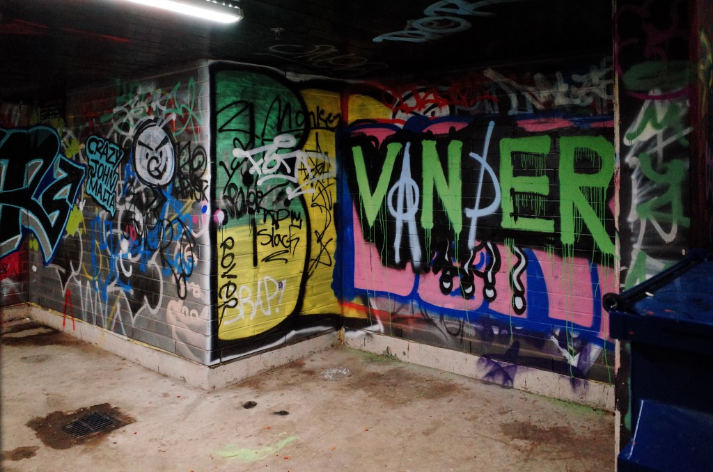
While I did the majority of my shooting through the late afternoon and evening in monochrome, I couldn’t help by see how the positive film simulation in my Ricoh GRs would showcase the vibrant colours of graffiti under artificial lighting situations.

It was only once I’d brought the images home and looked at them that it became apparent that the majority of the photos were made from the same angle. I had no idea I was doing this at the time but, in hindsight, I definitely wish that I’d made images from wider variety of angles.

When I was wandering through some of the alleys I wished that there had been more people about to include in some of the images. Even a wisp of a figure would, I think, have added a bit of a haunting character to many of the photographs.

In their absence, however, I largely (though not completely) tried to channel Tatianna Hopper. She sometimes engages in a kind of street photography that simultaneously showcases the existence and absence of humans. Graffiti and human trash, or waste, expresses this concept to my mind.

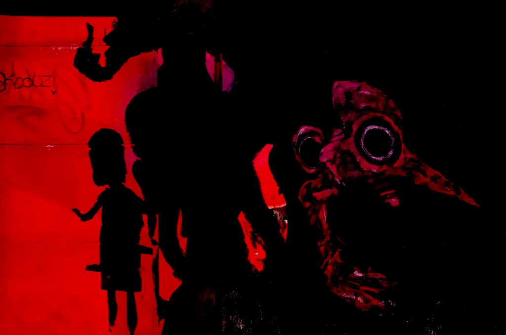
In a number of alleys there were quasi-monstrous or demonic imagery. I see more and more of it around the city and have met the artists of some of it. The effort they’re putting in is amazing with really interesting effects; when shooting with humans in the frame and in monochrome, I find the graffiti adds an interesting graphic element and juxtaposition. Even on its own, however, the juxtaposition between colour and monochrome graffiti causes its own novel contrast.

Almost the entirety of 2022, and the tail end of 2021, saw me shoot 99% of my images in monochrome. I’m happy with the progress I’ve made on the street and can see the very real improvements in composition and ability to ‘see’ in monochrome. However I’m inspired by Alex Webb and Gustavo Minas’ ‘Maximum Shadow Minimal Light’. Both use shadow in colour photography and I’d like to develop similar skills . Maybe that means I’ll experiment some through the year in trying to translate what I’ve learned about light and shadows in monochrome images into colour photos!

Categories
Photo Essay Photography Writing

Which Photo (Or Three…) Best Represents 2022?

‘Til Pandemic Does Us Part | Excluded Audience | Amour by Christopher Parsons

Neale James, host of the Photowalk, challenged the ‘Extra Milers’ to look through our pictures and find one (or three…) which really spoke to our 2022. It could be a best photograph, or one that captures some memory or another, or really anything…the question was deliberately left pretty open to interpretation.

It served as a good experience for me. I went back through the past 11 months of images and, in the process, was reminded of numerous photos and experiences I’d forgotten about.

The first image (“‘til Pandemic Does Us Part”) speaks to how seriously some were still taking the pandemic much earlier in the year.

‘Til Pandemic Does Us Part by Christopher Parsons

The second (“Excluded Audience”) is very similar to an image I made in early 2020 which defined that stage of the pandemic in Toronto for me. “Excluded Audience” is meant to call back to that image and showcase that while things were going back to normal as the year progressed, that normal isn’t necessarily positive for everyone in the city. I’ve also included that reference image (“Down But Not Out”) below, after the set, just to indicate what I was trying to call back to.

Excluded Audience by Christopher Parsons

The final image of the year in this set (“Amour”) is meant to document how things are, today, with those in love able to see and hold one another amongst crowds once more. As a set, I think they have a symmetry in story and composition across them.

Amour by Christopher Parsons

And, finally, the reference image really just captures what Toronto was like in the early days of the pandemic when the entire downtown core had just shut down in its entirety.

Down But Not Out by Christopher Parsons

In terms of process for selecting photos, most years I start by reviewing images that I posted to social media that year, which in 2022 has been Glass. From the 300-365 images I work down to 30 images or so that best tell the story of the year. However, using this process I miss some photos that I really like but haven’t uploaded and, at the same time, include some images in the sort that I’ve somewhat fallen out of favour with since posting them.

All of which is to say: I think that going through and taking the time to review/re-examine all the images we’ve taken over a year is a splendid exercise, and especially because there’s a bit of time between when an image was captured and now. For me, at least, this helped to surface work that resonates more today than I think that it did when I first made it.

How do you go through and review your photos annually? What’s your best photo or photo set of the year, and what’s the story behind them?